In the ever-evolving world of digital design, precision once meant working down to the exact pixel. Designers obsessed over perfect alignments, fixed dimensions, and tightly controlled layouts. Yet as devices multiplied and screen sizes diversified, that rigid approach began to show its limits. Pxless has emerged as a progressive philosophy that challenges traditional pixel-based design and embraces flexibility, adaptability, and user-centred thinking.
Understanding the Meaning Behind Pxless
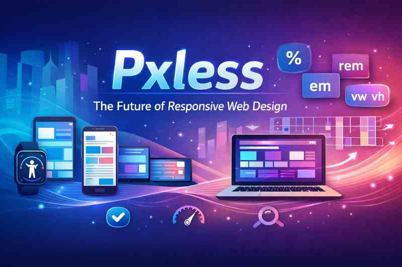
At its core, Pxless represents a move away from fixed pixel units in digital design. Traditionally, web interfaces were built using precise pixel measurements, such as 200px widths or 16px font sizes. While this created consistent visuals on specific screens, it often failed to adapt gracefully to different resolutions or user settings.
The philosophy behind Pxless is not about removing precision; rather, it redefines precision. Instead of relying on absolute units, designers use relative measurements such as percentages, ems, rems, viewport widths, and flexible grid systems. These units allow layouts to respond dynamically to the context in which they are viewed.
In simple terms, Pxless prioritises proportion over rigidity. Elements scale relative to one another and to the device, ensuring visual harmony regardless of screen size.
Why Pixel-Perfect Design No Longer Suffices
For years, pixel-perfect design was considered the gold standard. Designers would create mock-ups in fixed dimensions and expect developers to replicate them exactly. However, this method was largely rooted in a time when desktop screens dominated the market.
Today, users browse websites on smartphones, tablets, laptops, ultrawide monitors, smart TVs, and even wearable devices. A layout that looks flawless on a 1440px desktop screen may break or appear cramped on a small mobile device.
This is where Pxless thinking becomes essential. Instead of chasing exact pixel values, designers focus on relationships between elements. A heading might scale proportionally to the viewport, while margins adjust based on screen width. The experience feels natural because it adapts fluidly.
The Core Principles of Pxless Design
1. Relative Units Over Absolute Units
One of the defining characteristics of Pxless is the use of relative measurement units. For example:
- rem for scalable typography
- em for contextual sizing
- % for fluid containers
- vw and vh for viewport-based scaling
These units allow text and components to respond to user preferences, such as increased browser font size, which improves accessibility.
2. Fluid Grids and Layout Systems
Instead of fixed-width containers, modern layouts use flexible grids. CSS Grid and Flexbox enable content to rearrange itself intelligently. Columns can shrink, expand, or wrap without breaking the overall structure.
3. Accessibility as a Foundation
A significant benefit of Pxless design is improved accessibility. When users zoom in, change font sizes, or use assistive technologies, layouts built with relative units respond smoothly. Text remains readable, and elements do not overlap or disappear.
4. Device-Agnostic Thinking
Designing with Pxless principles means letting go of the idea that there is one “correct” screen size. Instead, interfaces are built to work everywhere. This mindset is especially important for businesses serving diverse audiences across the UK.
How Pxless Enhances User Experience
User experience is not just about visual appeal; it is about comfort, clarity, and usability. A layout that scales naturally feels intuitive. Users do not need to pinch and zoom excessively or scroll sideways to read content.
With Pxless, typography adapts to screen width, ensuring optimal readability. Spacing remains proportional, preventing clutter. Buttons remain touch-friendly on smaller devices. These improvements may seem subtle, but collectively they make a powerful difference.
From an SEO perspective, responsive and accessible design also contributes to better performance. Search engines favour websites that provide smooth mobile experiences, and adaptability is central to that goal.
Implementing Pxless in Modern Web Development
Using rem for Typography
Setting a base font size in the root element allows all other font sizes to scale proportionally. For example, if the root font size is adjusted, headings and paragraphs automatically resize.
This approach ensures consistency while maintaining flexibility.
Leveraging CSS Grid and Flexbox
CSS Grid enables designers to define flexible columns using fractions rather than fixed pixel widths. Flexbox allows elements to align and distribute space dynamically within a container.
Together, these tools embody the spirit of Pxless by removing dependence on rigid structures.
Responsive Spacing Techniques
Margins and padding defined in relative units maintain visual balance across devices. For instance, using percentage-based padding can create consistent proportions regardless of screen size.
Media Queries as Enhancements
While relative units handle much of the adaptation, media queries still play a role. They allow designers to refine layouts at specific breakpoints without locking everything into fixed dimensions.
Pxless and the Rise of Mobile-First Strategy
Mobile-first design has become a best practice in the UK and globally. Instead of designing for large screens first, developers start with smaller devices and scale upwards.
The Pxless philosophy aligns perfectly with this approach. By focusing on flexible layouts from the outset, designers ensure that content remains usable on compact screens without sacrificing aesthetics on larger displays.
As mobile browsing continues to dominate, adaptability is no longer optional; it is fundamental.
Common Misconceptions About Pxless
It Means No Structure
Some assume that abandoning pixel units leads to chaos. In reality, Pxless requires careful planning. Designers must think deeply about proportions, hierarchy, and alignment. Flexibility does not mean randomness.
It Is Only for Large Projects
Even small websites benefit from fluid design principles. Whether it is a local UK business page or a large e-commerce platform, adaptability enhances user satisfaction.
It Eliminates All Pixel Usage
In practice, designers may still use pixels in certain contexts, such as borders or fine adjustments. The key is not total elimination but reducing dependency on rigid measurements.
Business Benefits of Embracing Pxless
Improved Conversion Rates
A website that feels comfortable and accessible encourages users to stay longer. Reduced friction often translates into higher engagement and conversion rates.
Lower Maintenance Costs
When layouts adapt naturally, fewer device-specific fixes are required. This reduces long-term development costs.
Future-Proofing Digital Assets
Technology evolves rapidly. New devices with unconventional screen sizes are introduced regularly. Pxless prepares websites for these changes by prioritising flexibility from the beginning.
The Role of Pxless in Inclusive Design
Inclusivity is no longer a niche consideration. UK regulations and ethical standards increasingly demand accessible digital experiences.
Because Pxless supports scalable text and adaptive layouts, it aligns closely with inclusive design principles. Users with visual impairments, motor difficulties, or specific accessibility needs benefit from layouts that respond gracefully to their settings.
By adopting Pxless, organisations demonstrate a commitment to accessibility and social responsibility.
Real-World Applications Across Industries
From media platforms to online retailers and educational institutions, fluid design is becoming standard practice. Government websites in the UK, for instance, prioritise readability and scalability to serve diverse populations.
Corporate brands also recognise that consistent experiences across devices strengthen brand identity. A site that functions seamlessly on mobile and desktop reinforces trust and professionalism.
Challenges in Transitioning to Pxless
Shifting from pixel-based design can require a mindset change. Teams accustomed to fixed mock-ups may initially struggle with fluid thinking. Clear communication between designers and developers becomes even more important.
Design systems play a crucial role here. Establishing scalable typography scales, spacing guidelines, and responsive components ensures consistency while maintaining flexibility.
The Future Outlook of Pxless
As technologies such as foldable screens and augmented reality interfaces develop, rigid pixel-based design will become even less practical. Adaptability will define the next generation of digital experiences.
The principles behind Pxless position it not merely as a trend but as a sustainable evolution in design methodology. Businesses that adopt this philosophy today are better prepared for tomorrow’s innovations.
FAQs
What does Pxless actually mean in web design?
It refers to a design approach that reduces reliance on fixed pixel units and instead uses relative measurements for flexibility.
Is Pxless suitable for small business websites?
Yes, even simple websites benefit from scalable typography and fluid layouts that improve usability on mobile devices.
Does Pxless remove all pixel measurements?
Not entirely. Pixels may still be used sparingly, but the emphasis shifts towards relative units.
How does Pxless improve accessibility?
It allows content to scale naturally when users adjust font sizes or zoom settings, maintaining readability and structure.
Is Pxless difficult to implement?
It requires thoughtful planning, but modern CSS tools make it practical and efficient to apply.
Conclusion
The digital landscape has changed dramatically over the past decade. Fixed pixel layouts, once seen as the pinnacle of precision, now struggle to keep pace with the diversity of devices and user preferences. Pxless offers a refined alternative, grounded in flexibility, accessibility, and proportion-based thinking.
By embracing relative units, fluid grids, and inclusive principles, designers and developers can craft experiences that feel natural on any screen. More than a technical adjustment, Pxless represents a philosophical shift towards adaptability and user-first design.