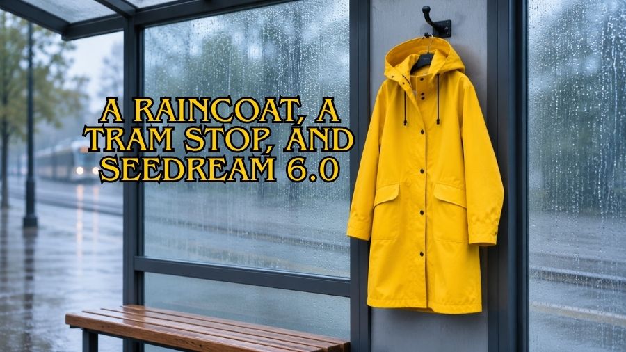
For a fictional outerwear label, I would build a campaign still around a yellow raincoat hanging from a simple hook at a covered tram stop. No model, no crowded street, and no dramatic storm. The coat would be the brightest object in a quiet blue-gray scene, with a few rain marks on the glass behind it. The picture would suggest an everyday commute while giving the garment a clear, recognizable shape.
The unusual placement is deliberate. A coat on a hook can reveal its length, hood, and front opening without the distractions of a face or pose. At the same time, the tram-stop setting gives it a reason to exist beyond a studio wall. I would label this as a concept image for an invented campaign, not a photograph of a real public installation or proof of how a specific fabric performs in rain.
My starting materials would be a simple garment sketch and a small palette: warm yellow for the coat, charcoal for the hook, and cool muted tones for the shelter. If the project involved real merchandise, authorized product photographs would replace the invented sketch. The visible seams, fasteners, and proportions would then need to match the actual item before the image could be used to promote it.
The scene depends on the relationship between the coat and its surroundings, which is why Seedream 6.0 fits this proposed image study. I could generate a still composition from the brief and edit the background, light, or framing around the garment. The image model’s contribution would remain visual; it would not establish waterproof ratings, material specifications, or any other product claim.
Give the yellow room to work
I would place the coat slightly right of center, with the shelter’s vertical frame behind it and a broad quiet area to the left. The lower hem should remain above the ground so its shape is easy to see. A small fold near one sleeve could suggest weight, but the garment should not look as though an invisible person is wearing it. The hook would be visible enough to explain the support.
My initial Seedream 6.0 prompt would describe a minimalist fashion editorial still of a yellow raincoat hanging on a dark hook inside a covered urban transit shelter, soft overcast light, muted blue-gray glass, and a clean composition without people or signage. I would specify that the coat is the main subject and ask for no lettering. Those boundaries reduce the chance that the model fills the scene with posters, destination names, or unrelated street furniture.
The yellow should feel like fabric under cloudy light, not a glowing object. I would look for broad, soft highlights along the folds and slightly deeper tones under the sleeves. A shiny plastic appearance could undermine the intended texture. If the draft looked too glossy, I would request a more matte surface rather than simply lowering saturation and making the coat dull.
Rain belongs behind the garment
The glass could carry a few soft streaks that indicate weather without becoming the main subject. I would avoid heavy droplets across the coat itself, because that could imply a tested water-repellent treatment. The image only needs to establish a rainy-day context. A damp pavement outside the shelter and a cool, diffused background could communicate that context with less visual clutter.
In a Seedream 6.0 revision, I would keep the coat’s silhouette and ask for fewer, subtler rain marks on the rear glass. The background should remain legible as a shelter without showing a recognisable transit logo or invented route information. If a generation introduced distorted letters, I would remove the sign entirely. A blank structural panel would be more convincing than accidental pseudo-text.
The coat’s shadow would also need attention. In soft overcast conditions, a harsh black silhouette on the glass would feel inconsistent. I would prefer a gentle contact shadow around the hook and minimal directional shadow elsewhere. That restraint keeps the scene calm and helps the garment feel integrated with the shelter rather than pasted onto a separate background.
Correct the garment before polishing the mood
Even a fictional raincoat needs coherent construction. I would inspect whether the sleeves connect naturally, the hood opens in a plausible direction, and the front fastening follows a continuous line. A pocket that changes shape halfway down or an extra strap emerging from nowhere would distract from the design. These are visual issues that deserve correction before a color grade or campaign headline is considered.
Seedream 6.0 could support an edit focused on one of those features, such as simplifying the front fastening while retaining the overall garment. I would compare the revised image to the selected draft afterward. An apparently small request can alter nearby details, so the collar, hem, and sleeves would need another look. If fidelity to a real product were essential, a conventional composite with the actual product photograph could be the appropriate final approach.
I would keep the campaign concept to one dominant image rather than generating several unrelated weather scenes. A bus shelter at night, a mountain trail, and a sunlit balcony might all be attractive, but they would weaken this particular idea. The quiet commuter setting is the visual argument. Revisions should make that setting clearer instead of replacing it whenever a draft needs work.
Two formats, one recognisable coat
A portrait crop could serve a poster-like social image, while a wider version could leave room for a short headline. I would plan both around the same coat placement. For the wider composition, extending the empty glass panel would be more useful than adding another object. For the portrait crop, I would retain the hook and hem so the viewer can understand the complete silhouette.
When preparing the wider Seedream 6.0 variation, I would watch for changes to the garment’s proportions. The coat should not become longer simply because the frame is wider. I would also keep any final campaign wording separate from the image and set it in a layout tool. Exact copy, spacing, and contrast are easier to control when the letters remain distinct from the generated scene.
The last review would happen at the actual viewing sizes. On a phone, the yellow shape should remain clean and the hook should still explain why it is there. On a larger display, the folds and shelter frame should withstand closer inspection. I would keep an unlettered master so the artwork can be reused without regenerating the entire scene whenever the copy changes.
The finished Seedream 6.0 concept would be a still fashion image built around a simple contrast: a warm garment against a cool, ordinary commute. Its value would come from that visual clarity. There would be no need to claim a real campaign launch or invent performance results. One coherent scene can communicate a product mood while leaving factual promises to verified product information.